
Reimagining BodySoul Nature: A Distinctive Visual Identity Rooted in Authenticity and Simplicity
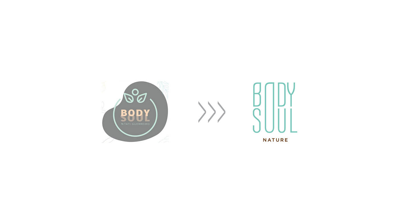
The previous visual identity did not effectively showcase the quality and benefits of the products, nor did it provide strong visibility in digital environments. To differentiate BodySoul Nature from the common tropes in the natural and organic products’ industry—such as leaves, flowers, fruits, and feminine silhouettes—we deliberately avoided these clichés and instead focused on presenting the brand name in a simple and authentic way.
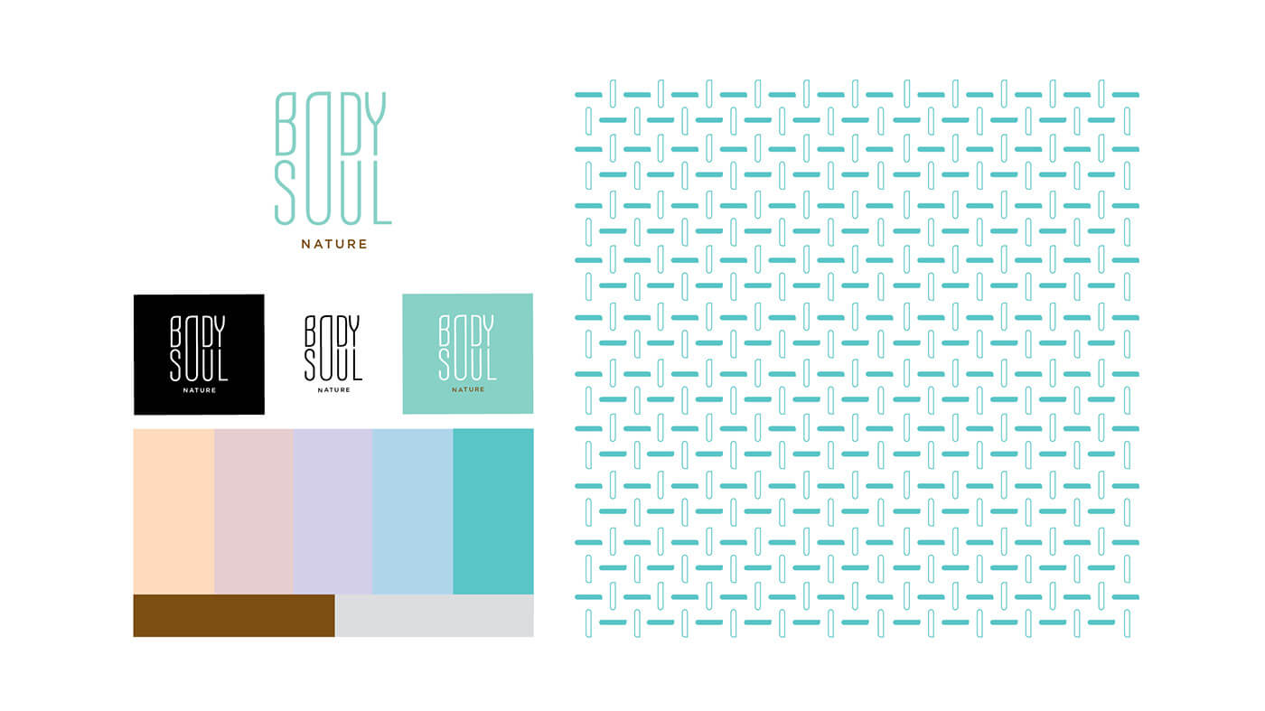
Our goal was to create a clean and easily understandable identity for the audience. Drawing inspiration from the exclusivity of BodySoul’s ingredients, we developed a unique connection between the words “Body” and “Soul” by transforming the letter “O” into a distinctive element—symbolizing the individuality of each client and product offered by BodySoul Nature.
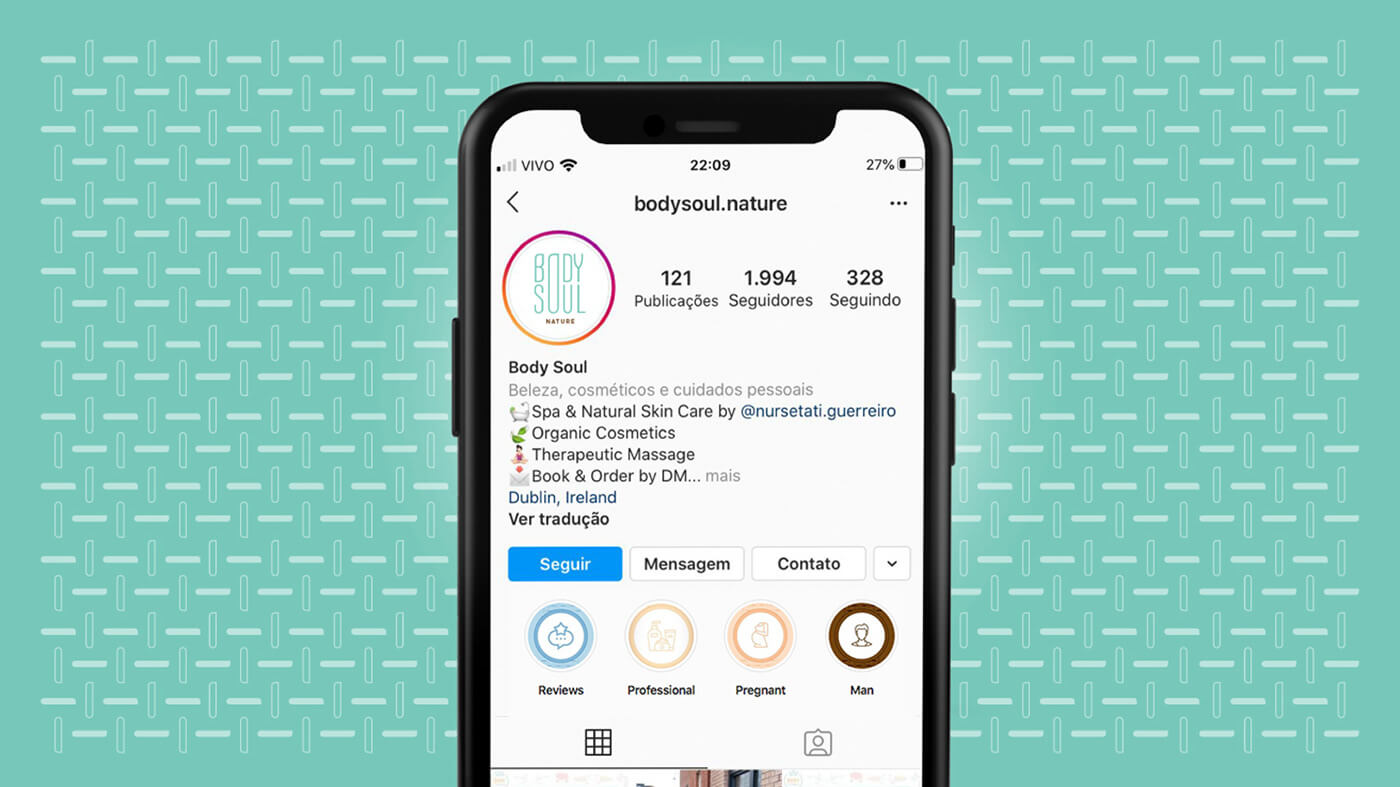
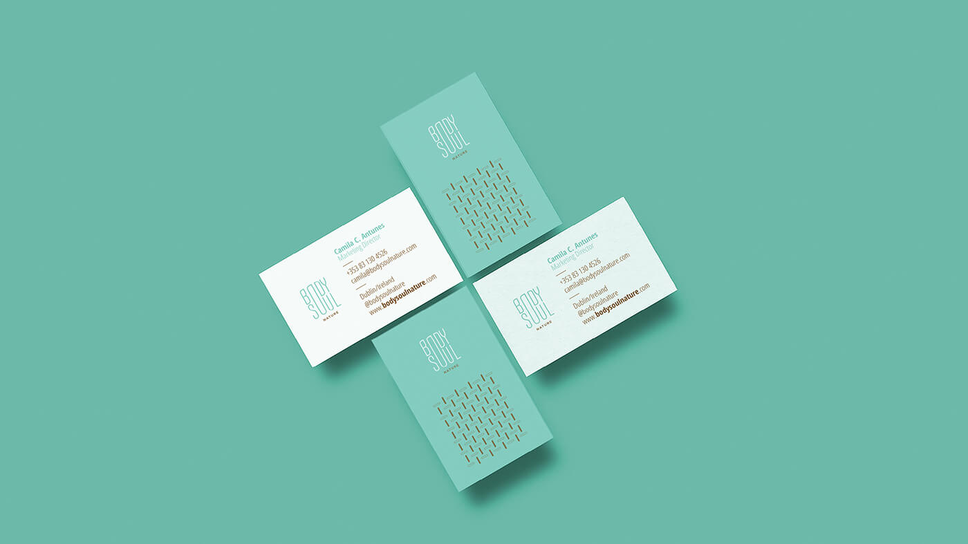
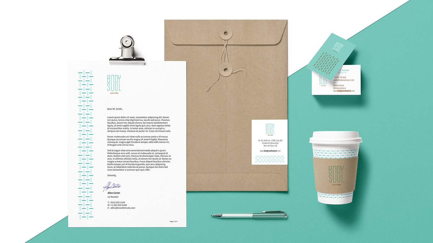
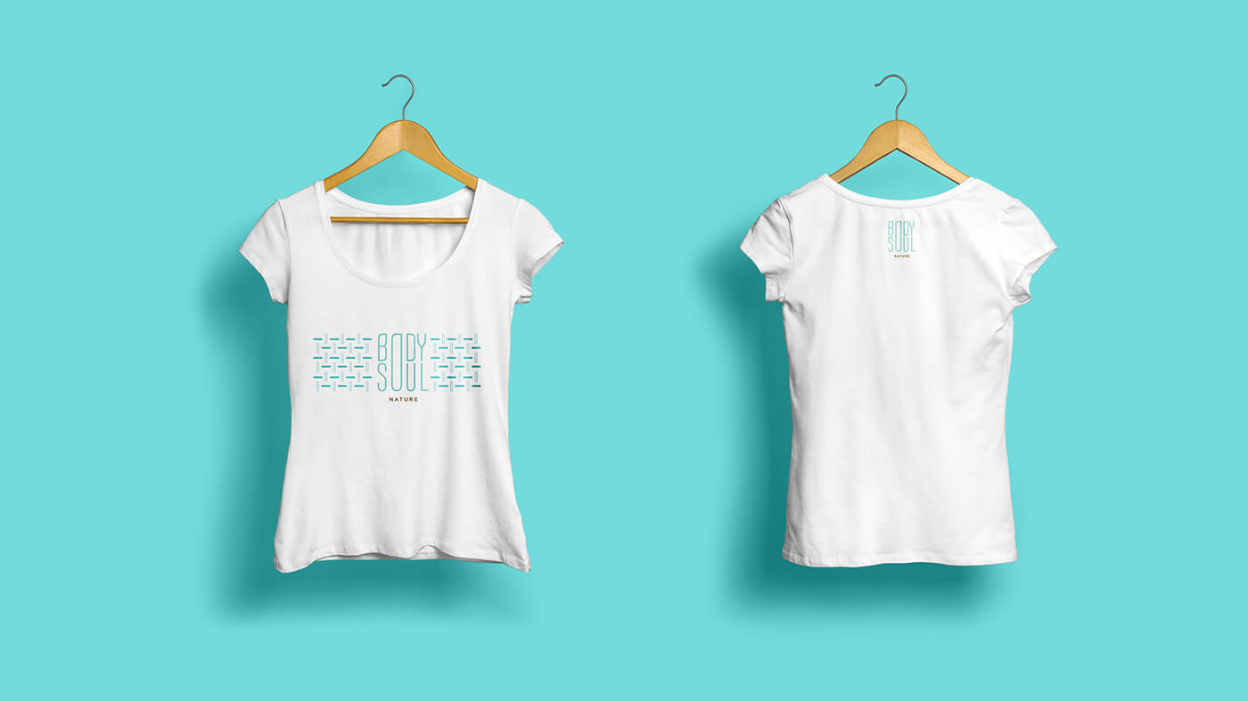
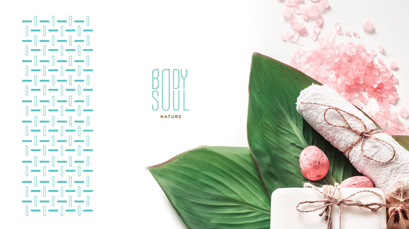
With the “O” elegantly resolved, we elevated it into an icon, using it as a graphic motif and pattern to support and unify the entire visual communication of the brand.
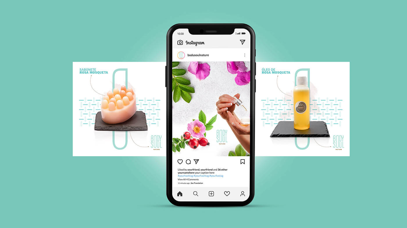
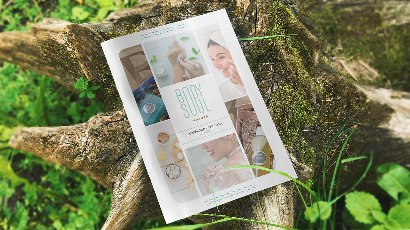
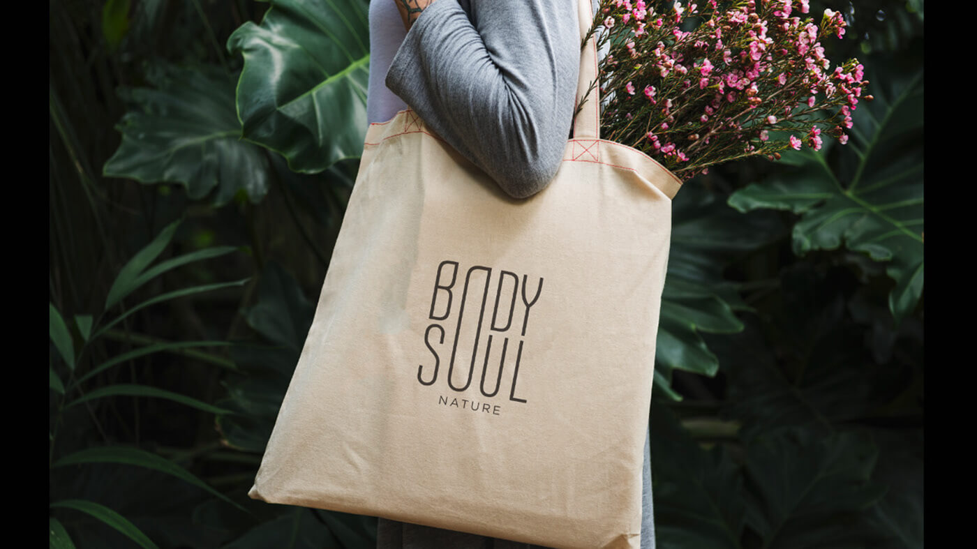
The logo is highly versatile, performing flawlessly across various backgrounds (white, green, black, gray) and applications, including social media, website, blog, and print materials.
This is Body Soul Nature: a brand created for people who love and protect nature, seeking to reconnect with it in all its forms.